Friday, 21 October 2011

Wix: Showing debug information on dialog boxes

In Wix, a property value can be <empty> or with some value.

One way to find debugging information in Wix is to show it on the setup dialog boxes. For instance, we can show the product code on the welcome dialog box if we find any previous version of the product. We can do this as follows:

<!-- FOR DEBUGGING  -->
<Control Id="Debug1" Type="Text" X="135" Y="150" Width="220" Height="60" Transparent="yes" NoPrefix="yes" Text="!(loc.Debug.WelcomeDlgTitleForUpgrade)" >
	<Condition Action="show">DEBUGGING</Condition>
	<Condition Action="hide">NOT DEBUGGING</Condition>
</Control>

Now we can pass the DEBUGGING parameter as one of the console argument:

msiexec /i "TestApp.msi" DEBUGGING=X                    ------when we want to show debugging information
(you can assign any value to DEBUGGING even 0 (zero), it will work as long as it is not empty)

msiexec /i "TestApp.msi" DEBUGGING=
or msiexec /i "TestApp.msi"                                        ------when we want it to run the normal way


Happy Wixing!

Monday, 10 October 2011

WPF: TreeView example (Part 4)

In the example shown in Part 3, we saw how to show a tree, with depth of 3.

But what about scenarios, where we do not really know the depth of the tree? Best example is Windows Explorer, it shows a tree with folders, sub-folders, more sub-folders and so on. How do build such a tree?

Let’s try to implement this. We create a class Folder:

    public class Folder
    {
        public string Name
        {
            get
            {
                if (!String.IsNullOrEmpty(Path))
                {
                    return io.Path.GetFileName(Path);
                }
                return null;
            }
        }
        public string Path
        { get; set; }
        public List<Folder> Folders
        { get; set; }
        public Folder()
        {
            Folders = new List<Folder>();
        }
        public static Folder CreateFolderTree(string rootFolder)
        {
            Folder fld = new Folder { Path = rootFolder };
            foreach (var item in io.Directory.GetDirectories(rootFolder))
            {
                fld.Folders.Add(CreateFolderTree(item));
            }
            return fld;
        }
    }

XAML:

        <TreeView Name="tv" ItemsSource="{Binding}" Background="Beige">
            <TreeView.ItemTemplate>
                <HierarchicalDataTemplate ItemsSource="{Binding Path=Folders}">
                    <Border BorderBrush="BurlyWood" BorderThickness="1">
                        <TextBlock Text="{Binding Path=Name}" />
                    </Border>
                </HierarchicalDataTemplate>
            </TreeView.ItemTemplate>
        </TreeView>

Loading data (in Window.cs):

List<Folder> folders = new List<Folder>();
folders.Add(Folder.CreateFolderTree(@"C:\WPFTest"));
tv.DataContext = folders;
Output:

image

In Windows explorer:

image 

So what changed here? The code generating business class is more or less same, the major change is in XAML. You will notice:

> We are using only a single HierarchicalDataTemplate. The display logic for each item uses the property – “Name”.
> We do specify the ItemsSource property but do not specify an ItemTemplate. This is the way of telling WPF that - the children of this TreeViewItem are in the ‘Folders’ property, however as I have not specified the ItemTemplate, please reuse the one I am using.
> We can use ‘Folders’ and ‘Name’ property without any problem because all the objects in the tree view are of same type – Folder.

And voila! We get to use the same HierarchicalDataTemplate for both the parent and its children.

Now the question is, what if we want to use different property for display – in parent and children? For instance, how do we show full folder path in the parent node, but just the folder name in the child?

Sunday, 9 October 2011

WPF: TreeView example (Part 3)

Continuing from the last post, let us add another level to our tree. For this we have to:

1> Change the DataTemplate to HierarchicalDataTemplate for the second level
2> Add a new DataTemplate to show the third level

The classes used in the sample:

    public class Category
    {
        public string Name
        { get; set; }
        public List<Company> ItemList
        { get; set; }
    }
    public class Company
    {
        public string Name
        { get; set; }
        public List<Product> Products
        { get; set; }
    }
    public class Product
    {
        public string Name
        { get; set; }
    }
Loading data in Window class:

  private void Load()
        {
            Company cMS = new Company { Name = "Microsoft", Products = new List<Product>() { new Product { Name = "Windows" }, new Product { Name = "MS Office" } } };
            Company cApple = new Company { Name = "Apple", Products = new List<Product>() { new Product { Name = "iPhone" }, new Product { Name = "iPad" }, new Product { Name = "Mac" } } };
            Company cIntel = new Company { Name = "Intel", Products = new List<Product>() { new Product { Name = "i5 Processor" }, new Product { Name = "i3 Processor" } } };
            Company cAMD = new Company { Name = "AMD", Products = new List<Product>() { new Product { Name = "Processor" } } };
            Category cSoftware = new Category { Name = "Software Companies", ItemList = new List<Company>() { cMS, cApple } };
            Category cHardware = new Category { Name = "Hardware Companies", ItemList = new List<Company>() { cIntel, cAMD } };
            List<Category> categories = new List<Category>();
            categories.Add(cSoftware);
            categories.Add(cHardware);
            tv.DataContext = categories;
        }
Modifying the XAML:

  <TreeView Name="tv" ItemsSource="{Binding}">
            <TreeView.Resources>
                <DataTemplate x:Key="productsTemplate">
                    <TextBlock Text="{Binding Path=Name}" />
                </DataTemplate>
                <HierarchicalDataTemplate x:Key="companyTemplate" ItemsSource="{Binding Path=Products}" ItemTemplate="{StaticResource ResourceKey=productsTemplate}">
                    <TextBlock Text="{Binding Path=Name}" />
                </HierarchicalDataTemplate>
            </TreeView.Resources>
            <TreeView.ItemTemplate>
                <HierarchicalDataTemplate ItemsSource="{Binding Path=ItemList}" ItemTemplate="{StaticResource ResourceKey=companyTemplate}">
                    <Border BorderBrush="BurlyWood" BorderThickness="2">
                        <TextBlock Text="{Binding Path=Name}" />
                    </Border>
                </HierarchicalDataTemplate>
            </TreeView.ItemTemplate>
        </TreeView>
Result:

image

Saturday, 8 October 2011

WPF: TreeView example (Part 2)


After creating the TreeView in XAML and code, let us bind the TreeView to a collection.

We create a list of strings and set it as DataContext to TreeView:

List<string> items = new List<string>() {"Apple","Oracle","IBM","Microsoft" };
this.DataContext = items;
XAML:
<TreeView Margin="10,10" DockPanel.Dock="Right" Name="tvList" ItemsSource="{Binding}">
 </TreeView>

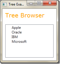
Result is:
image

This is working like a ListBox, what we need to use is hierarchical data. Let’s create the classes which we will use in binding.

Class Category:

  public class Category
    {
        public string Name
        { get; set; }
        public List<string> ItemList
        { get; set; }
    }


In the Window code-behind - we create two categories, add them to a list and set the list as the DataContext:

Category c1 = new Category { Name = "Software Companies", ItemList = new List<String>() { "Microsoft", "Oracle", } };
Category c2 = new Category { Name = "Hardware Companies", ItemList = new List<String>() { "Intel", "AMD", } };
List<Category> categories = new List<Category>();
categories.Add(c1);
categories.Add(c2);
tv.DataContext = categories;

XAML:

<Window x:Class="TreeView1.MainWindow"
        xmlns="http://schemas.microsoft.com/winfx/2006/xaml/presentation"
        xmlns:x="http://schemas.microsoft.com/winfx/2006/xaml"
        Title="Tree Example" Height="350" Width="525">
    <Grid>
        <TreeView Name="tv" ItemsSource="{Binding}">
        </TreeView>
    </Grid>
</Window>

This is what we get:


image
(Screenshots from XP look ugly, compared to Vista)


As with other list controls, TreeView also uses the default ToString() to show the data. Next, we use an ItemTemplate to show the relevant data.

Updated XAML:

        <TreeView Name="tv" ItemsSource="{Binding}">
            <TreeView.ItemTemplate>
                <DataTemplate>
                    <TextBlock Text="{Binding Path=Name}" />
                </DataTemplate>
            </TreeView.ItemTemplate>
        </TreeView>
Output:


image 
Well ok, so now we do get the Category name but what about the items we added in these categories? Let’s update the DataTemplate and use the ItemList property of the class Category:

        <TreeView Name="tv" ItemsSource="{Binding}">
            <TreeView.ItemTemplate>
                <DataTemplate>
                    <Border BorderBrush="BurlyWood" BorderThickness="2">
                        <StackPanel Orientation="Vertical">
                            <TextBlock Text="{Binding Path=Name}" />
                            <ListBox ItemsSource="{Binding Path=ItemList}"></ListBox>
                        </StackPanel>
                    </Border>
                </DataTemplate>
            </TreeView.ItemTemplate>
        </TreeView>

Result:

image
We see the items in each Category, but this is not what we expect from a TreeView. What about the ‘+’ signs? To show them, we need to use a different kind of ItemTemplate – HierarchicalDataTemplate.


The HierarchicalDataTemplate needs two things:
- it needs to know how to display the item data (which is just like a DataTemplate) and
- the Binding path of its children and the template to use to show them

Step 1> Define how the template shows its own data:

        <TreeView Name="tv" ItemsSource="{Binding}">
            <TreeView.ItemTemplate>
                <HierarchicalDataTemplate>
                    <Border BorderBrush="BurlyWood" BorderThickness="2">
                        <TextBlock Text="{Binding Path=Name}" />
                    </Border>
                </HierarchicalDataTemplate>
            </TreeView.ItemTemplate>
        </TreeView>

Step 2> We add the binding path of its children and their template:

<TreeView Name="tv" ItemsSource="{Binding}">
	<TreeView.Resources>
		<DataTemplate x:Key="childrenDataTemplate">
			<TextBlock Text="{Binding}" />
		</DataTemplate>
	</TreeView.Resources>
	<TreeView.ItemTemplate>
		<HierarchicalDataTemplate ItemsSource="{Binding Path=ItemList}" ItemTemplate="{StaticResource ResourceKey=childrenDataTemplate}">
			<Border BorderBrush="BurlyWood" BorderThickness="2">
				<TextBlock Text="{Binding Path=Name}" />
			</Border>
		</HierarchicalDataTemplate>
	</TreeView.ItemTemplate>
</TreeView>

image


You will notice we used HierarchicalDataTemplate for the first level (where we just show the category name), for the second level (showing the items in the category) we use the DataTemplate. When we are sure that the data is the last level in the hierarchy, we use the DataTemplate.

WPF: TreeView example (Part 1)


Let’s look at another often used control in business applications – TreeView. It is a great control to visualise hierarchical data. Take an example – of customer, their orders and order details. A lot of data without using TreeView – it can get little bit complex to show the relationship between the data.

Just like we have ListBox and its ListBoxItem where we can include any control – not just text; we have TreeView has TreeViewItem.

The XAML goes as:

   <TreeView Margin="10,10">
                <TreeViewItem Header="Sony">
                    <TreeViewItem Header="Order-123">
                        <TreeViewItem Header="LCD TV"/>
                        <TreeViewItem Header="Wii"/>
                        <TreeViewItem Header="Vaio"/>
                    </TreeViewItem>                    
                </TreeViewItem>
                <TreeViewItem Header="Apple">
                    <TreeViewItem Header="Order-1">
                        <TreeViewItem Header="iPod"/>
                        <TreeViewItem Header="iPhone"/>
                        <TreeViewItem Header="iPad"/>
                    </TreeViewItem>
                    <TreeViewItem Header="Order-2">
                        <TreeViewItem Header="Mac"/>
                    </TreeViewItem>
                </TreeViewItem>
            </TreeView>            

Not the best data, but I hope good enough to use in a TreeView.

The output is:


image

How do we add items in code? We have instantiate TreeViewItem objects and add it to the “Items” collection. For e.g.:

TreeViewItem item = new TreeViewItem();
item.Header = "1";
item.Items.Add(new TreeViewItem { Header = "10" });
item.Items.Add(new TreeViewItem { Header = "11" });
item.Items.Add(new TreeViewItem { Header = "12" });
TreeViewItem item2 = new TreeViewItem();
item2.Header = "2";
item2.Items.Add(new TreeViewItem { Header = "20" });
item2.Items.Add(new TreeViewItem { Header = "21" });
item2.Items.Add(new TreeViewItem { Header = "22" });
tv.Items.Add(item);
tv.Items.Add(item2);

image


Now we have set the Foreground colour of Window class to Orange – but we do not get Orange on the TreeView text Why?

You will see that when a TreeViewItem is selected, its foreground colour turns to White and background to blue.

image

So if the ‘White’ foreground colour inherits down to the other TreeViewItems – then their fore colour will also change to White – making then invisible.

To test this, let’s add a TextBlock as a child without using TreeViewItem:

<TreeViewItem Header="Order-1">
	<TreeViewItem Header="iPod"/>
	<TreeViewItem Header="iPhone"/>
	<TreeViewItem Header="iPad"/>
	<TextBlock Text="Apple TV" />
</TreeViewItem>


image


As you can see here, a TextBlock inherits its foreground colour from its parent – ‘Order-1’ TreeViewItem – and so appears to be hidden. This means that each TreeViewItem uses system settings for their colour settings – when selected. So:

- When we are using TreeViewItem, the property values are not inherited from parent
- When using controls directly, property values are inherited

So how do we set a common foreground for all the TreeViewItems?

Thursday, 6 October 2011

Apple


A great line about Steve Jobs, who passed away today: “It is easy to sell your work if you believe in it”.

Steve, you will be missed!

Wednesday, 5 October 2011

TO READ


http://www.microsoft.com/casestudies/Case_Study_Detail.aspx?CaseStudyID=4000008716

Good link - .NET/WPF Performance leaks


http://blogs.msdn.com/b/jgoldb/archive/2008/02/04/finding-memory-leaks-in-wpf-based-applications.aspx

http://msdn.microsoft.com/en-us/library/ee658248.aspx

WPF: Binding example (Part 6)


This post deals with performance problems with DataGrids.

If you test the WPF Task Manager application we have been developing in last few posts, you will notice that we experience a lag when we scroll the process grid – or click the grid to open its row details containing the threads.

There is a concept of ‘virtualization’ in WPF. It basically means the UI object which is not shown on the screen is virtualized or to say taken out of memory. This reduces the no. of objects which is supposed to improve performance.

Grid has two properties which change the virtualization - EnableRowVirtualization and EnableColumnVirtualization.

By default: EnableRowVirtualization is true and EnableColumnVirtualization is false. This is why when you scroll down or up quite quickly you notice a lag – the virtualized objects are being brought to life when they become visible.

In WPF task manager if we change the value EnableRowVirtualization to false (it is true be default) you will notice a considerable improvement in performance. We can set this on inner grid as well.

I think WPF is still doing some operations (could be lazy load) – because if you click a row for the first time and its row details open up, and then if you do it again the row details show up much faster compared to first time.

WPF: Binding example (Part 5)


Continuing with our WPF binding series with WPF Task Manager – today we will work with row details in DataGrid control.

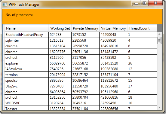
We were able to see all the processes in the grid:

image

You will note an additional column – ThreadCount which indicates the no. of threads active in that process.

Each process can have many threads, so the Process object which we are using to fill our List<Process> collection – has a property Threads which is ProcessThreadCollection containing objects of type ProcessThread.

We will modify our grid to show details of these threads for a process. For this design using RowDetails would be an ideal solution.

In XAML file just below the data grid columns definition, we add the <DataGrid.RowDetailsTemplate> tag to define the row detail. This is just like ItemTemplate in ListBox and we can use any control or layout here. But since we are showing a collection (of threads) in row details why not use another grid here. The XAML is:

<DataGrid Grid.Column="0" Grid.Row="1" ItemsSource="{Binding Path=ProcList}" Background="Gray" Foreground="Black" Name="lst" IsReadOnly="True" AutoGenerateColumns="False"
                  EnableRowVirtualization="False">
            <DataGrid.Columns>
                <DataGridTextColumn Header="Name" Binding="{Binding Path=ProcessName}" />
                <DataGridTextColumn Header="Working Set" Binding="{Binding Path=WorkingSet}"/>
                <DataGridTextColumn Header="Private Memory" Binding="{Binding Path=PrivateMemorySize}"/>
                <DataGridTextColumn Header="Virtual Memory" Binding="{Binding Path=VirtualMemorySize}"/>
                <DataGridTextColumn Header="ThreadCount" Binding="{Binding Path=Threads.Count}"/>
            </DataGrid.Columns>
            <DataGrid.RowDetailsTemplate>
                <DataTemplate>
                    <DataGrid ItemsSource="{Binding Path=Threads}">
                        <DataGrid.Columns>
                            <DataGridTextColumn Binding="{Binding Path=Id}" Header="Id" />
                            <DataGridTextColumn Binding="{Binding Path=BasePriority}" Header="BasePriority" />
                            <DataGridTextColumn Binding="{Binding Path=StartTime}" Header="StartTime" />
                            <DataGridTextColumn Binding="{Binding Path=TotalProcessorTime}" Header="TotalProcessorTime" />
                        </DataGrid.Columns>
                    </DataGrid>
                </DataTemplate>
            </DataGrid.RowDetailsTemplate>
        </DataGrid>

image

Notice we have to click a row to get its child grid.

The grid needs some colour. To make alternating rows appear differently we use the attributes - AlternationCount="2" AlternatingRowBackground="LightBlue" for outer grid and RowBackground=”Beige” for inner grid.

This is what we get:

image

CruiseControl.NET: Display error/warning on the ccnet project’s main page

How do we display an error or warning message on the ccnet project’s main page?

We generally write ECHO messages:

<echo message="Problem with your build: ${error.code}."/> 
But this will log the message only to the ‘NAnt Output’ log.
To display the message on the project’s home page, we need to add the Level attribute with an appropriate setting: Error or Warning.
<echo message="Problem with your build: ${exit.code}." level="Error"/>

Tuesday, 4 October 2011

WPF: Binding example (Part 4)


We saw in the last post how we can change the UI of our WPF Task Manager to show all the processes in a grid layout using a ListView control. ListView is useful when we are restricted to .NET 3.5, because in .NET 4.0 framework we have the DataGrid control. There are certain shortcomings in ListView – one being it doesn’t allow automatic sorting of rows. Even if we implement sorting it doesn’t give a visual hint on the column we clicked to sort data. DataGrid is a complete control with all the important features. So let’s modify our application to use the DataGrid control.

We start by removing the ListView tag in XAML and replacing it with:

<DataGrid Grid.Column="0" Grid.Row="1" ItemsSource="{Binding Path=ProcList}" Background="Gray" Foreground="Black" Name="lst" HorizontalContentAlignment="Stretch">
</DataGrid>

And we get this:

image

Cool! All the columns are automatically generated and the cell type changes based on the data it holds. For e.g. HasExited is a bool so it changes to a check box.

But we do not need all the columns so let’s remove them.

We add this attribute AutoGenerateColumns="False" to the grid tag and add the DataGridTextColumns in the DataGrid.Columns collection.

        <DataGrid Grid.Column="0" Grid.Row="1" ItemsSource="{Binding Path=ProcList}" Background="Gray" Foreground="Black" Name="lst" HorizontalContentAlignment="Stretch"
                   AutoGenerateColumns="False">
            <DataGrid.Columns>
                <DataGridTextColumn Header="Name" Binding="{Binding Path=ProcessName}" />
                <DataGridTextColumn Header="Working Set" Binding="{Binding Path=WorkingSet}"/>
                <DataGridTextColumn Header="Private Memory" Binding="{Binding Path=PrivateMemorySize}"/>
                <DataGridTextColumn Header="Virtual Memory" Binding="{Binding Path=VirtualMemorySize}"/>
            </DataGrid.Columns>
        </DataGrid>
image

Shorts - week 3, 2022

Post with links to what I am reading: 1. A very good post on different aspects of system architecture: https://lethain.com/introduction-to-a...